HomeBrandingKri Kri Rodeo – Refreshing an Iconic Ice Cream Brand
Kri Kri Rodeo – Refreshing an Iconic Ice Cream Brand
The Request
Kri Kri assigned Leoussis_a with the refresh and redesign of Rodeo ice cream packaging, aiming to modernize the brand while preserving its recognizability and playful identity.
The objective was not to create a completely new packaging, but to carefully evolve Rodeo into a more contemporary and visually impactful product for today’s consumers.
The Challenge
The existing packaging system relied heavily on dark backgrounds and doodle-style graphics across all flavors. While recognizable, the packs lacked appetite appeal and did not fully communicate the indulgent experience of the product itself.
The challenge was therefore delicate:
refresh the identity without losing brand recognition
modernize the visual language without alienating existing consumers
and make the actual ice cream and flavor experience far more desirable and visible
The Insight
Ice cream is ultimately an impulse product. Consumers choose with their eyes first.
The craving, the texture and the flavor need to become immediately visible and emotionally appealing from the shelf. At the same time, Rodeo’s playful personality was an important asset that needed to evolve rather than disappear.
The Approach
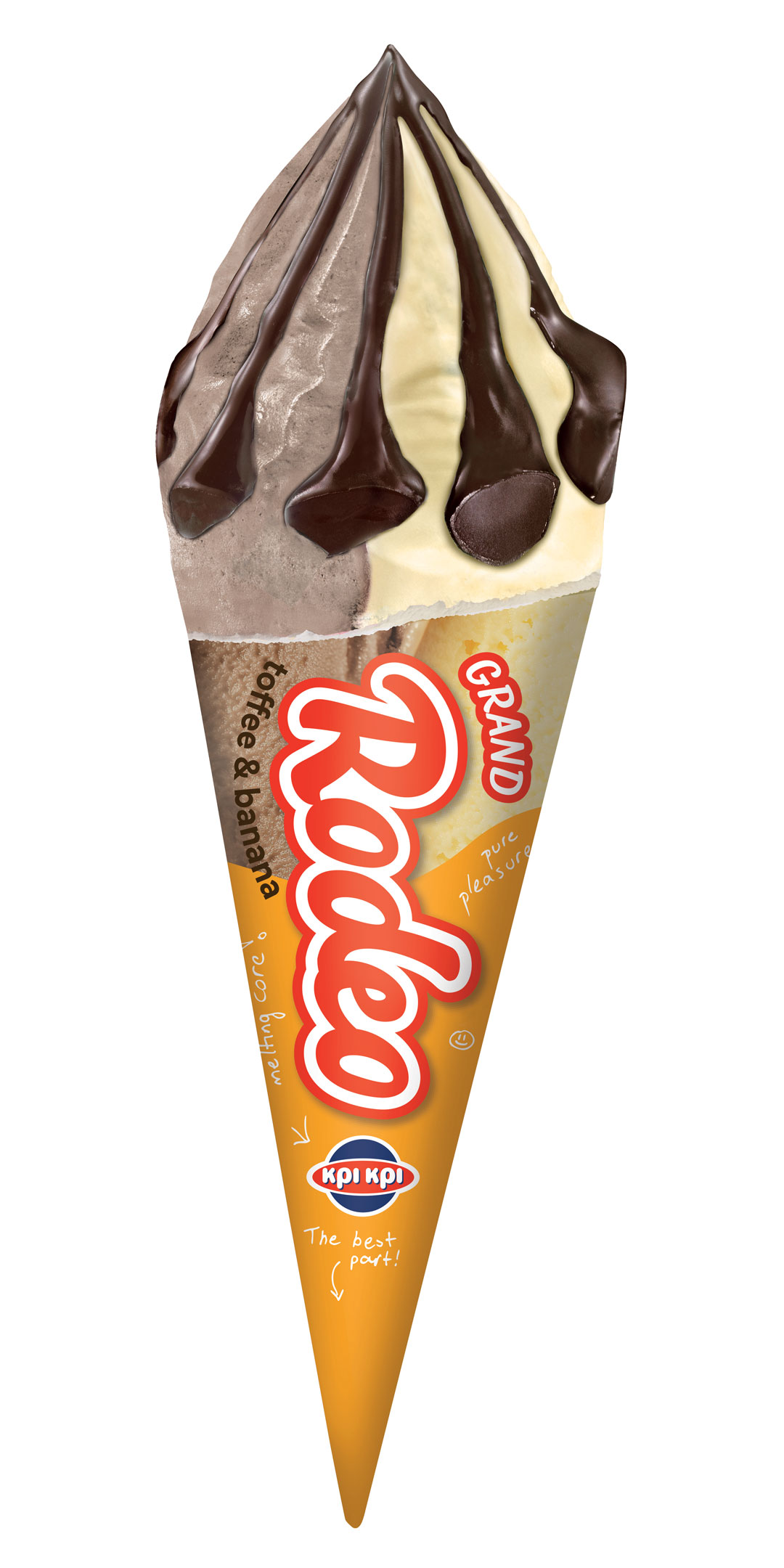
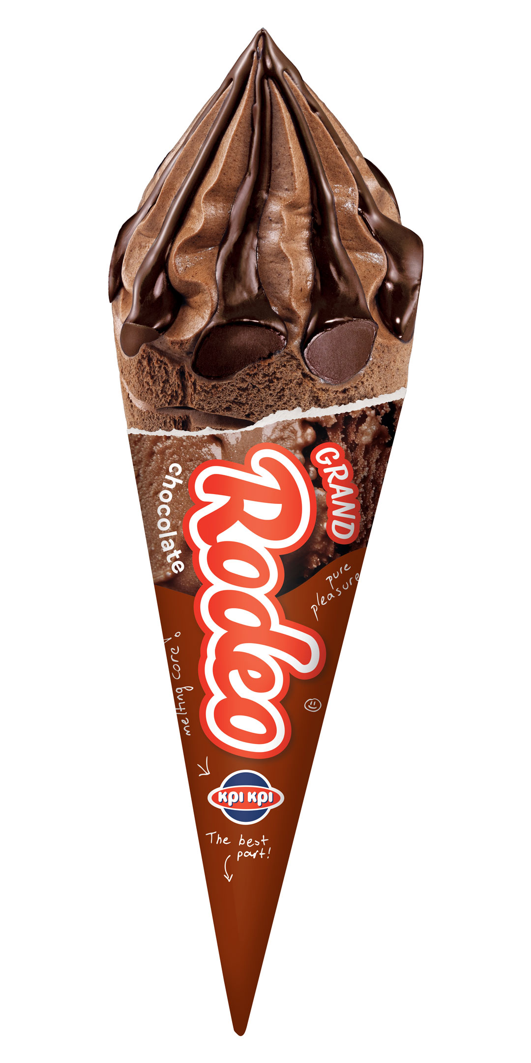
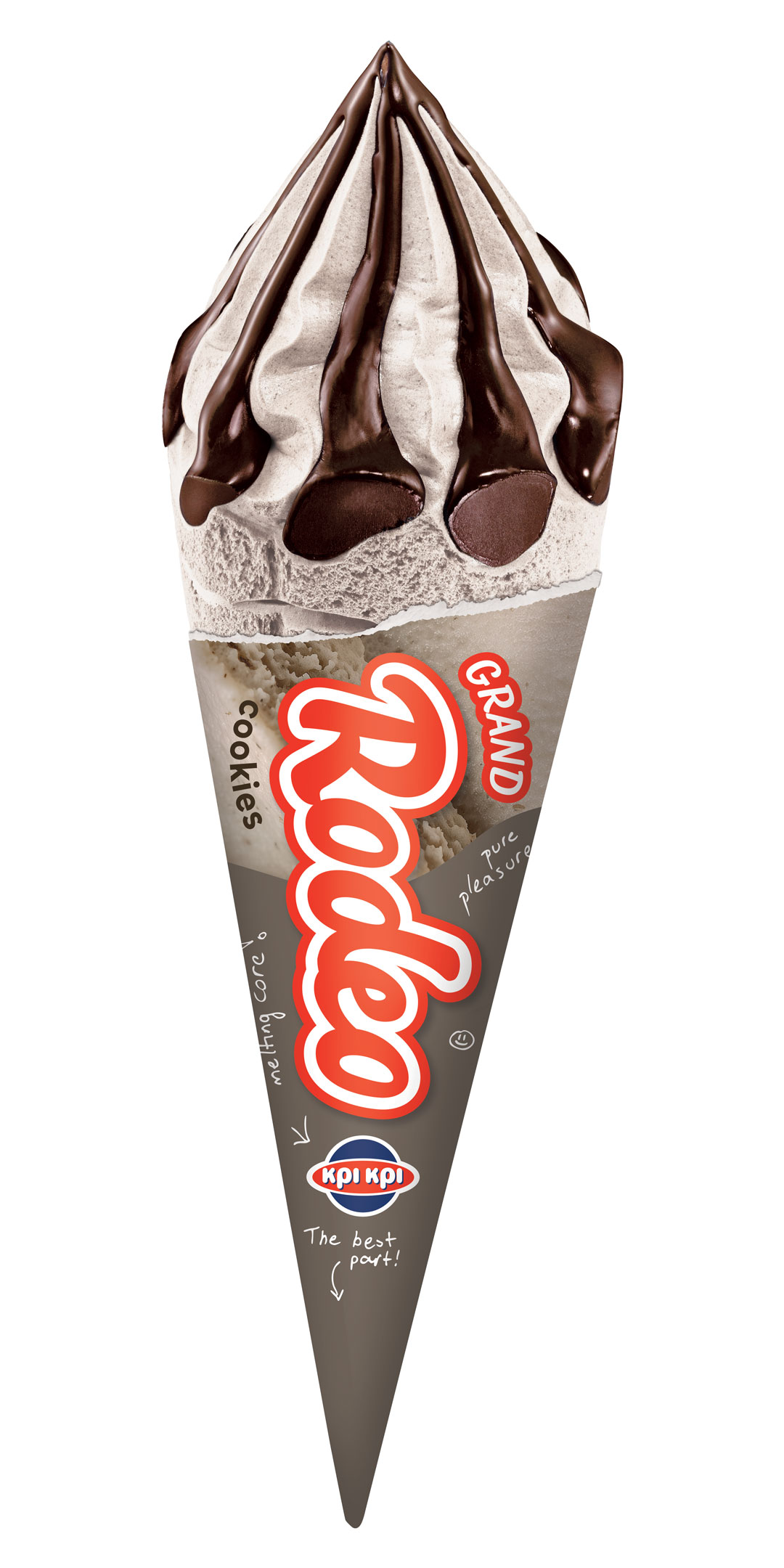
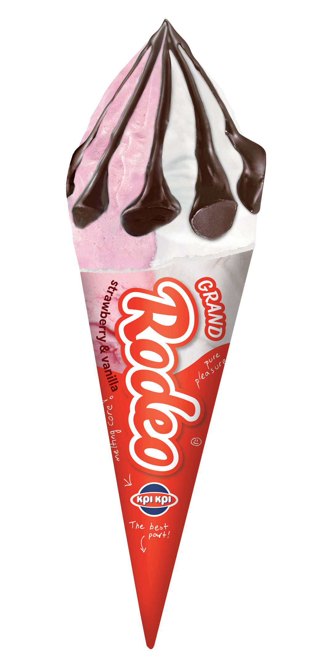
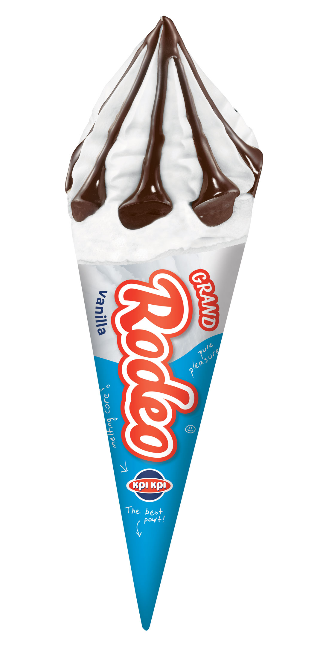
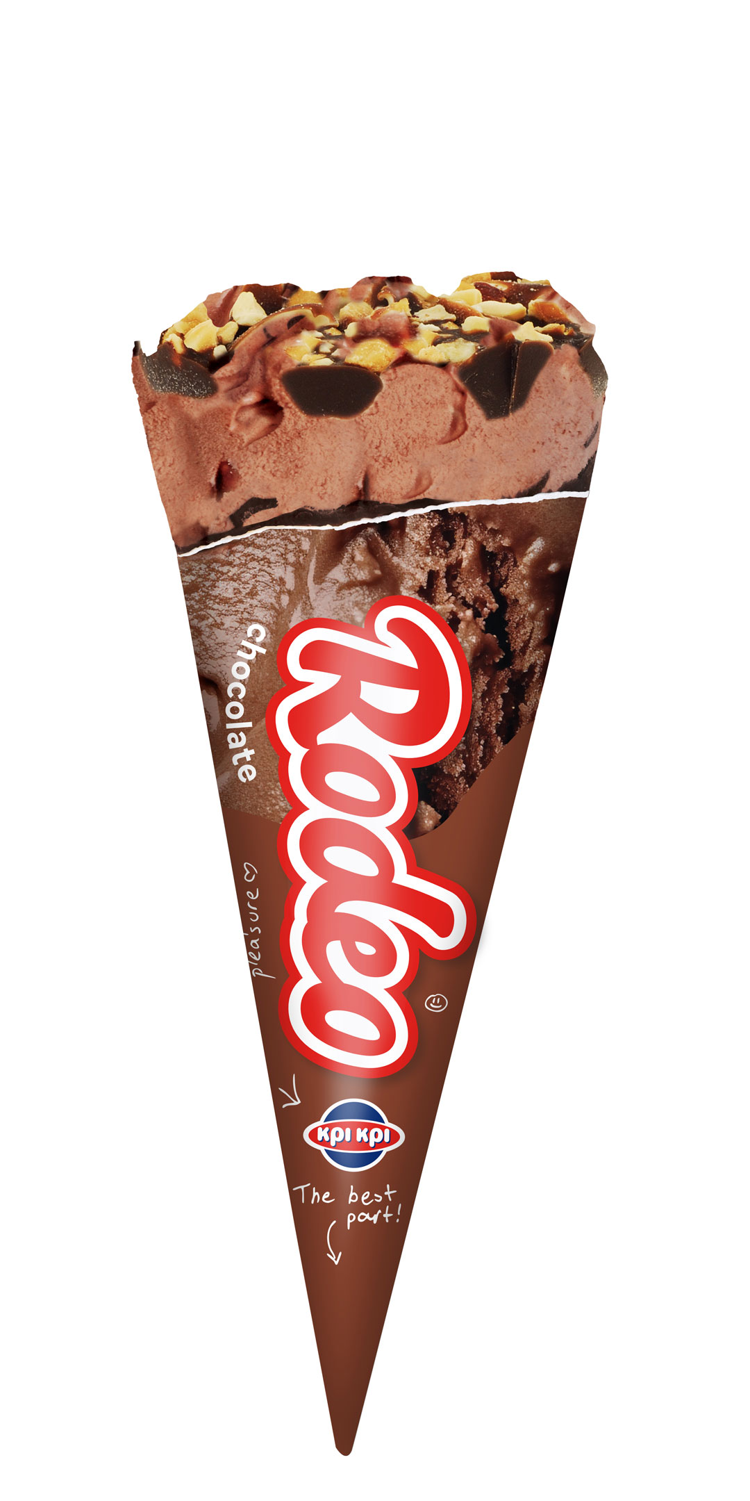
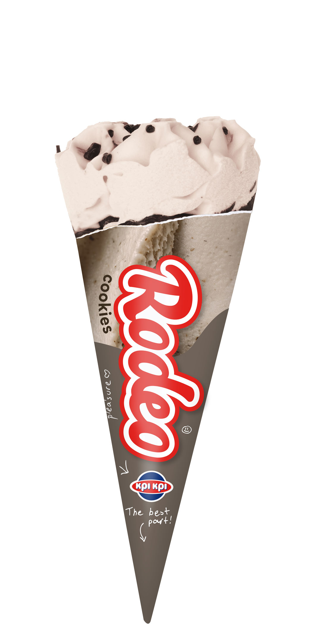
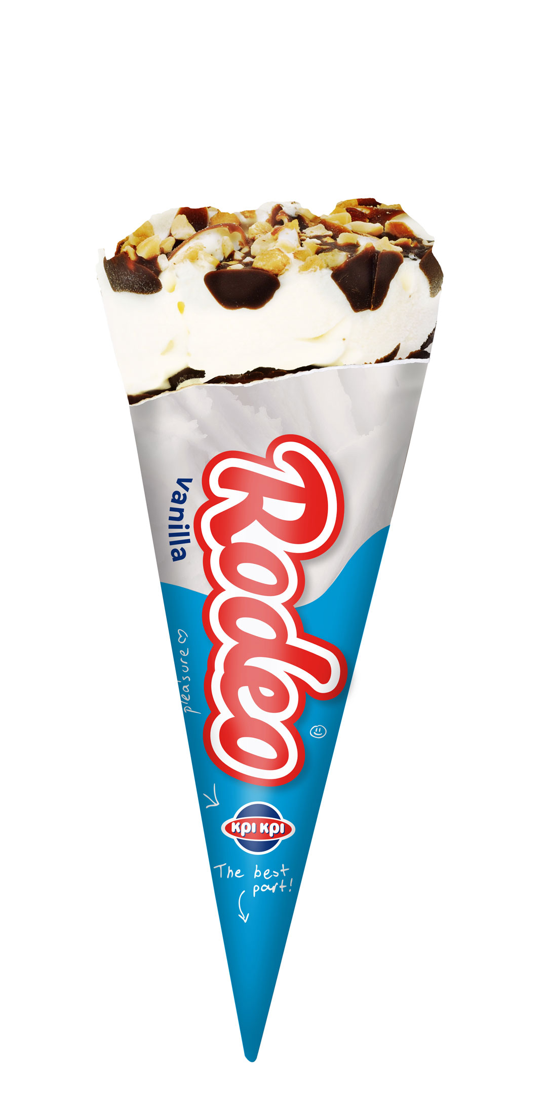
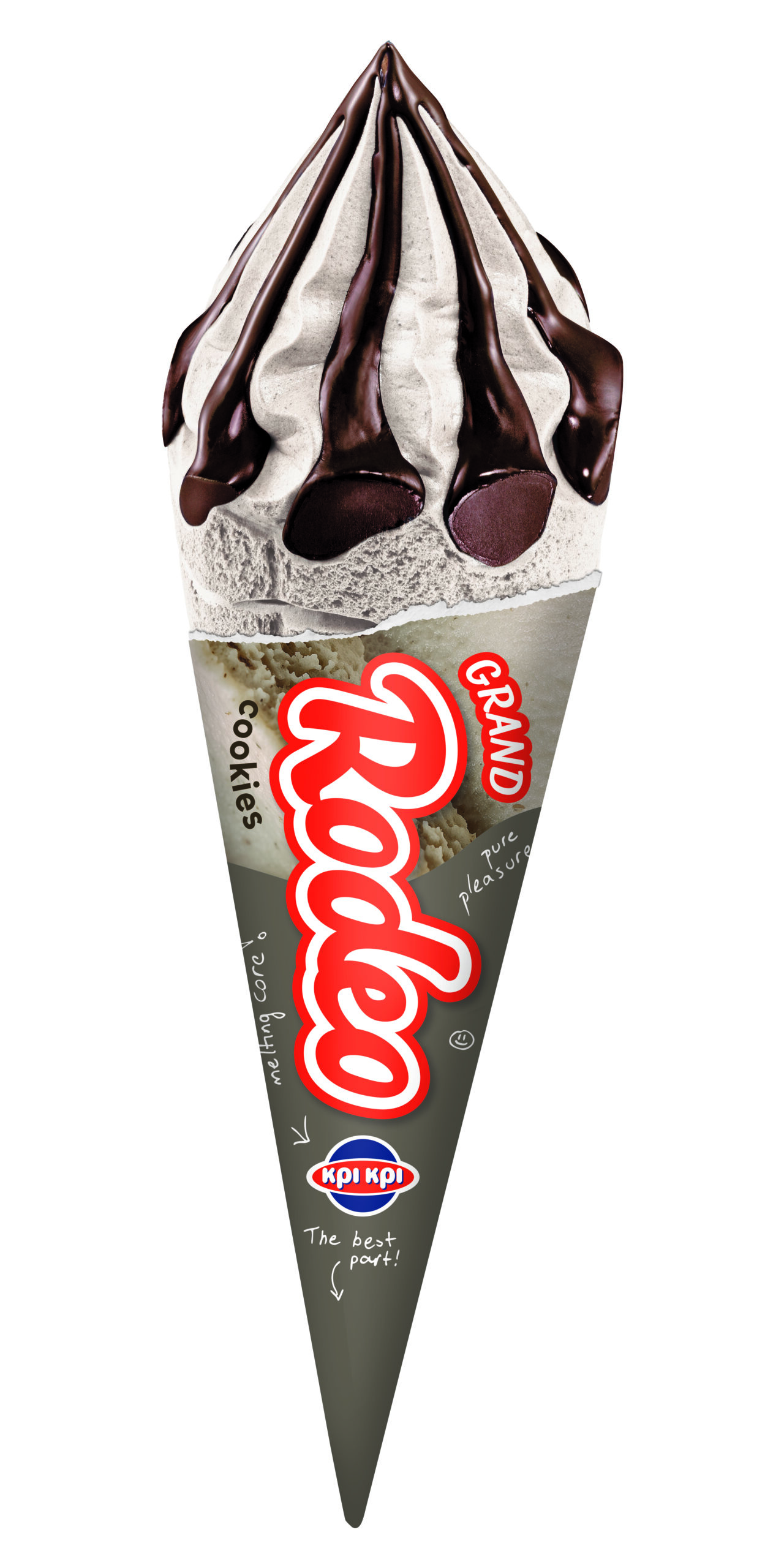
We redesigned the packaging system by bringing the product itself into focus. The upper part of each pack became a more indulgent representation of the actual ice cream, allowing the flavor and texture to take center stage and instantly communicate craving and enjoyment.
At the same time:
the logo was refreshed and modernized
the overall composition became cleaner and bolder
and a strong color-coding system was introduced, giving each flavor its own distinctive visual identity
The playful doodle element was preserved conceptually, but evolved into a handwritten typographic system featuring fun, flavor-related messages that reinforced the youthful and spontaneous character of the brand.
The Result
The new Rodeo packaging system successfully balanced familiarity with freshness.
The redesign preserved the recognizability of the brand while making the products more contemporary, flavorful and visually engaging.
Through stronger appetite appeal, clearer flavor distinction and a more modern visual language, Rodeo gained a renewed shelf presence that feels youthful, fun and instantly memorable.