HomeAbove the lineOMEGA Rice Cakes – Packaging Design for a New Product Launch
OMEGA Rice Cakes – Packaging Design for a New Product Launch
The Request
Omega introduced a new rice cakes product line aiming to enter a more modern, health-conscious and younger market segment. The challenge was to create a packaging system that would feel contemporary and appealing while maintaining the trust and credibility of the Omega brand.
The packaging needed to clearly differentiate flavors, communicate natural ingredients and stand out strongly on shelf among highly competitive snack products.
The Challenge
Rice cakes often fall into a visual category that feels overly “healthy,” generic or outdated. Most products rely heavily on nutritional messaging, creating packaging that lacks appetite appeal and emotional connection.
For Omega, the challenge was to reposition rice cakes as both:
a healthy everyday snack
and an enjoyable, modern lifestyle product
At the same time, the packaging system needed enough flexibility to support multiple flavors and future product extensions.
The Insight
Consumers may choose rice cakes for health reasons, but they still buy with emotion and appetite.
Instead of designing around “diet culture,” we focused on indulgence, craving and visual simplicity. Each product needed to immediately communicate flavor, personality and freshness from a distance.
The legume or ingredient itself became the hero element of the pack, while bold colors and a strong typographic structure created instant recognition.
The Idea
We designed a clean and impactful packaging system based on:
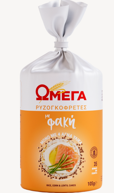
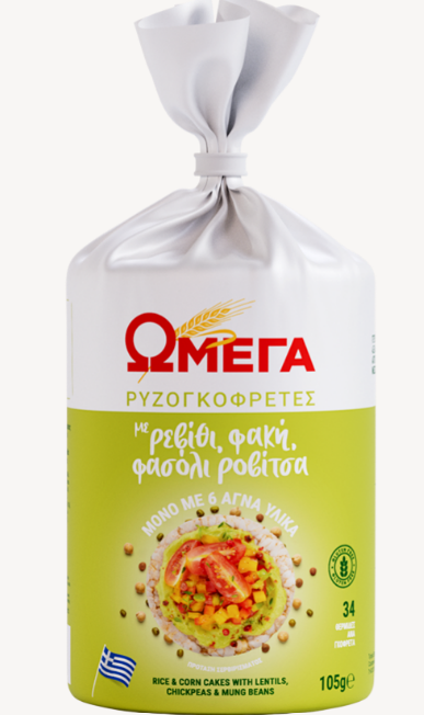
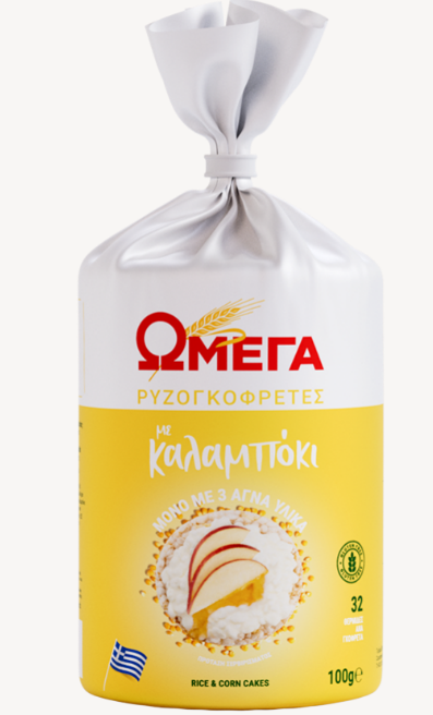
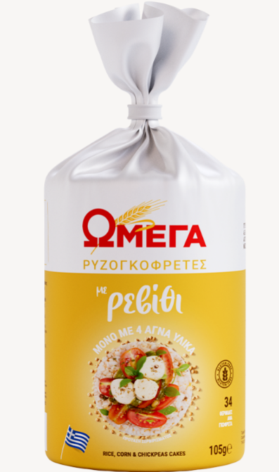
strong color coding for each flavor and legume
large and highly visible Omega branding
minimal, modern composition
appetizing ingredient photography
contemporary typography targeted to younger audiences
Each pack was designed to feel fresh, vibrant and easy to recognize, while still maintaining consistency across the full product range.
The use of bold colors transformed the products into eye-catching shelf statements, helping the new line feel closer to a modern snack brand rather than a traditional health-food product.
The Result
The final packaging system positioned Omega Rice Cakes as a contemporary and accessible lifestyle product. Chic, simple and highly memorable, the design helped the new range stand out immediately on shelf while reinforcing Omega’s evolution toward a younger and more modern brand identity.