With a heritage spanning more than 73 years and a leading position in the Cretan coffee market, Dandalis Coffee sought to refresh its espresso and filter coffee product lines.
The objective was to modernize the brand’s image while preserving its strong recognition and legacy. The new packaging needed to communicate premium quality, stand out on the shelf, and appeal to a younger audience without losing the trust of existing consumers.
Our Approach
We began by rethinking the brand’s visual identity from the ground up, starting with a redesign of the Dandalis logo.
Rather than departing from the brand’s heritage, we refined and modernized the existing logo, preserving its familiar character while introducing a cleaner, fresher, and more contemporary feel. This updated identity became the foundation for the entire packaging system.
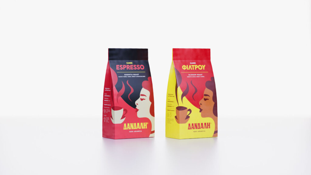
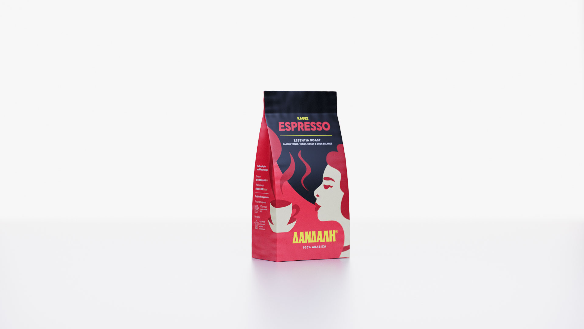
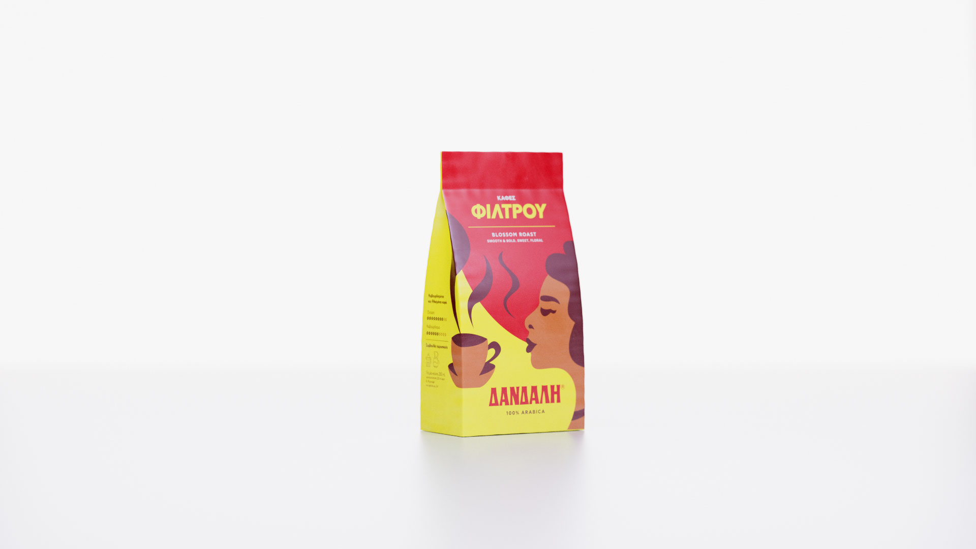
A key element we retained was the iconic illustration of the woman smelling the coffee—a visual asset deeply associated with the Dandalis brand. By reinterpreting this familiar symbol within a more modern design language, we maintained continuity while elevating the overall brand perception.
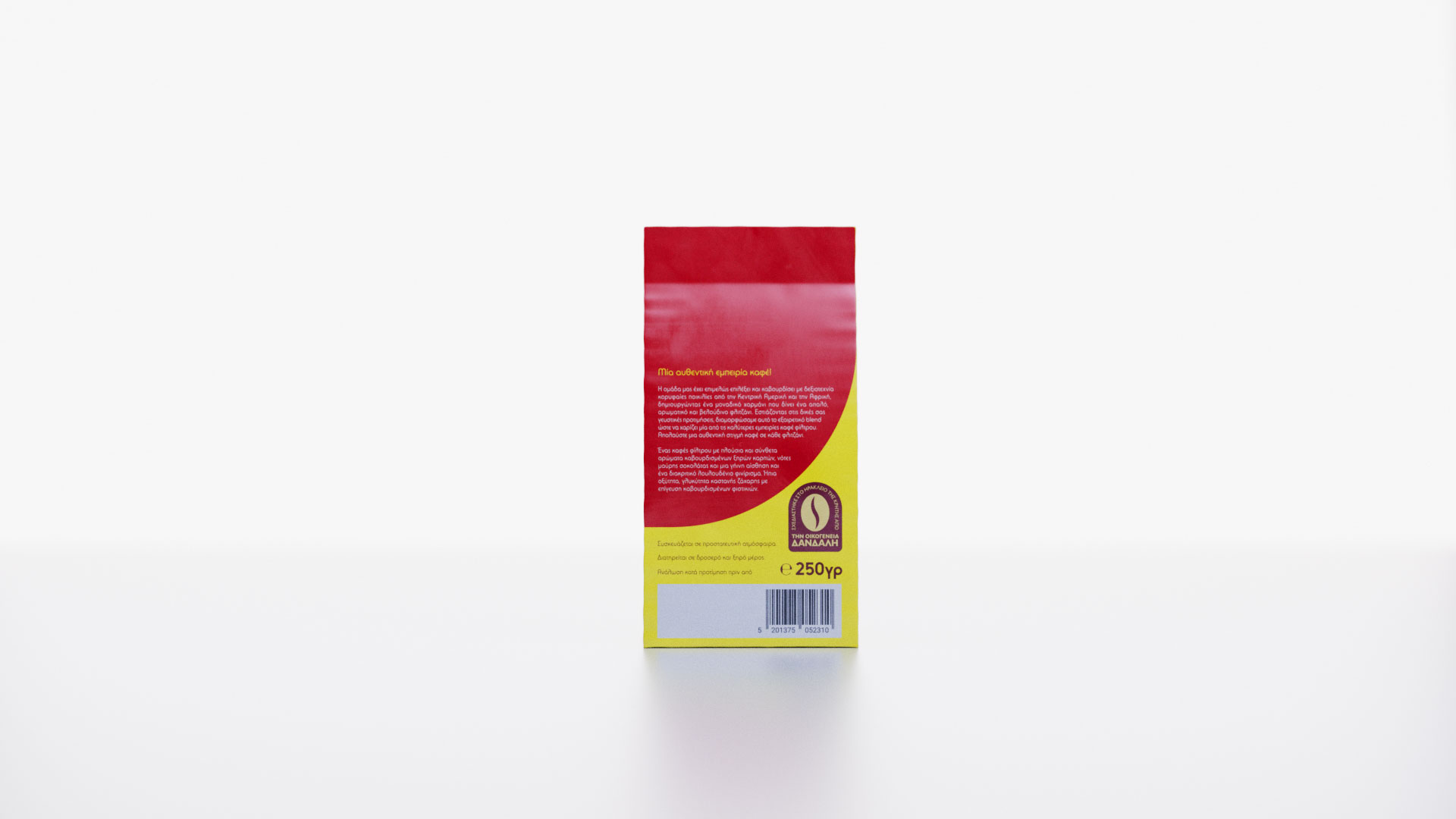
The new packaging combines vibrant colors with sophisticated graphic elements, creating a visual identity that feels premium, contemporary, and instantly recognizable.
Our Approach
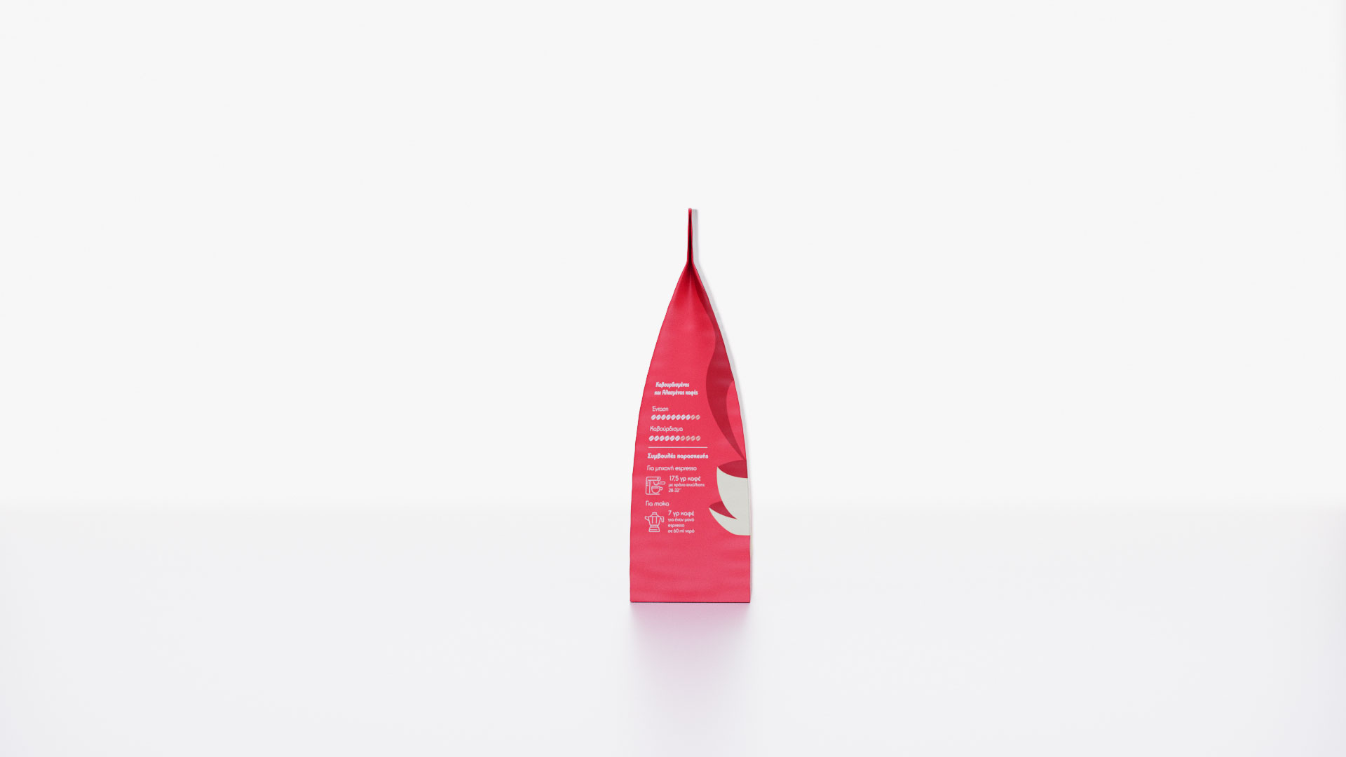
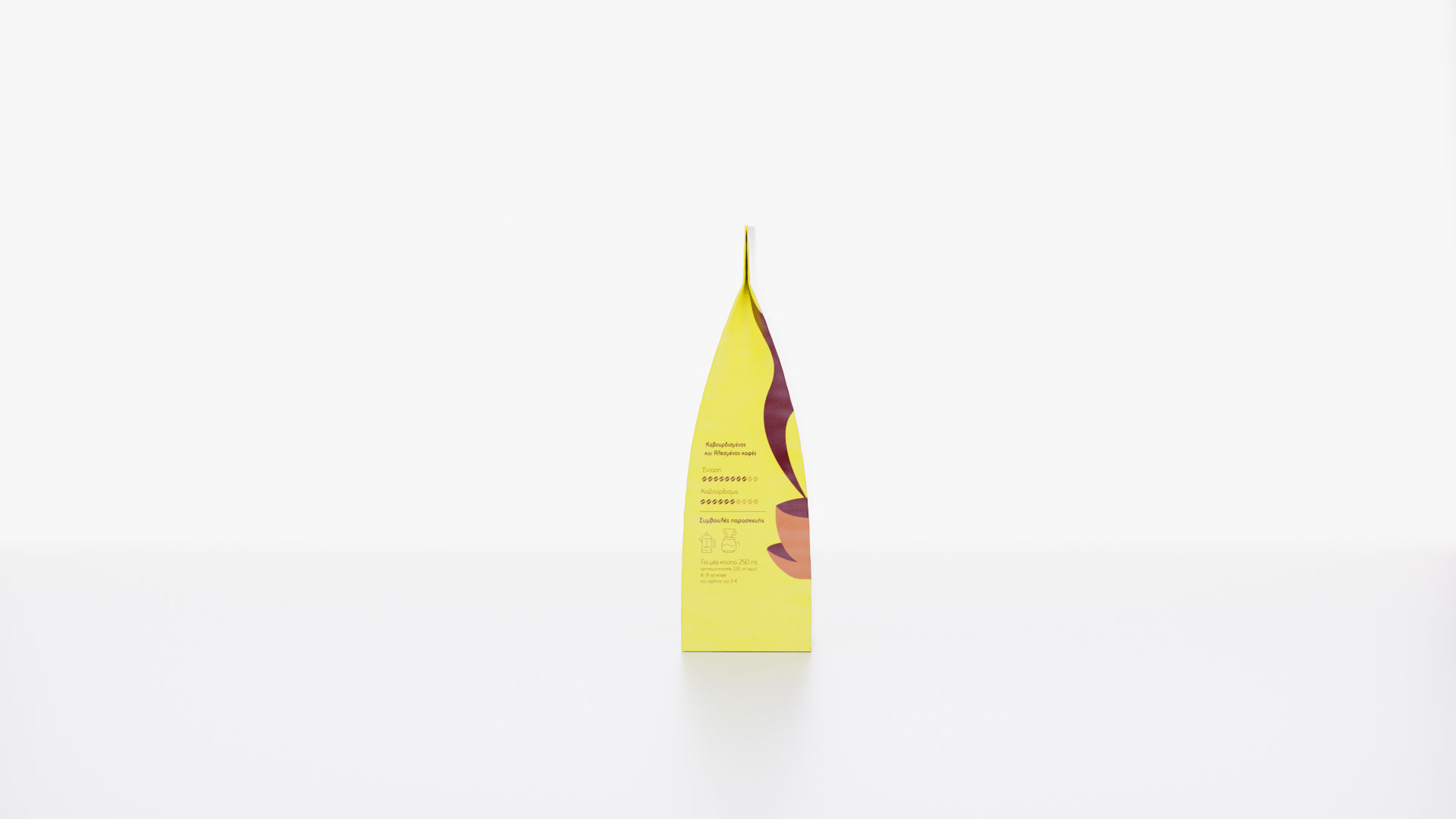
To improve product differentiation and shelf navigation, we developed a clear color-coding system across the range.
The brand’s signature red was retained as the core visual anchor, while distinct color pairings were introduced for each category:
Red & Black for the Espresso range
Red & Yellow for the Filter Coffee range
This system allows consumers to easily distinguish between product families while maintaining a cohesive and unified brand presence.
Packaging Design System
The packaging was designed around a clean, structured layout that allows the refreshed logo, bold color palette, and key brand elements to take center stage.
To add depth and character, the front design extends onto the side folding panels, creating a continuous visual experience around the pack. This subtle detail introduces a playful touch while strengthening brand recognition and enhancing shelf impact.
The result is a packaging system that balances practicality and portability with a distinctly premium appearance.
Logo Redesign
The logo redesign was a crucial part of the project.
By refining the existing mark rather than replacing it, we preserved the brand’s heritage while introducing a more contemporary aesthetic. The updated typography and graphic treatment create a stronger, more confident identity that better reflects the quality of the products and the evolving positioning of the brand.
The new logo serves as a bridge between tradition and modernity—honoring the past while preparing Dandalis Coffee for the future.
The Result
The redesigned packaging and visual identity introduced a stronger, more cohesive brand presence that successfully balances heritage and innovation.
The new system:
Modernizes the brand while preserving its recognizability
Differentiates product categories through strategic color coding
Communicates quality and sophistication at first glance
Enhances shelf visibility and consumer engagement
Appeals to a younger audience without alienating loyal customers
The final outcome is a contemporary and elegant packaging system that celebrates Dandalis Coffee’s 73-year legacy while positioning the brand for its next chapter of growth.
This version reads more like a premium branding agency case study and focuses on the strategic decisions behind the redesign rather than simply describing visual elements.