Kriton Artos, a brand known for its quality bakery products, aimed to revamp the identity of MIKIO Bites—a delicious, on-the-go breadstick snack designed for young, active consumers.
The goal was to create a fresh and playful brand identity that would stand out on the shelves, appeal to a younger demographic, and reflect the fun, flavorful nature of the product.
Our Approach
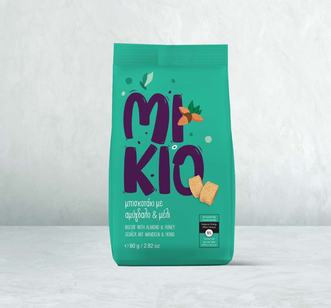
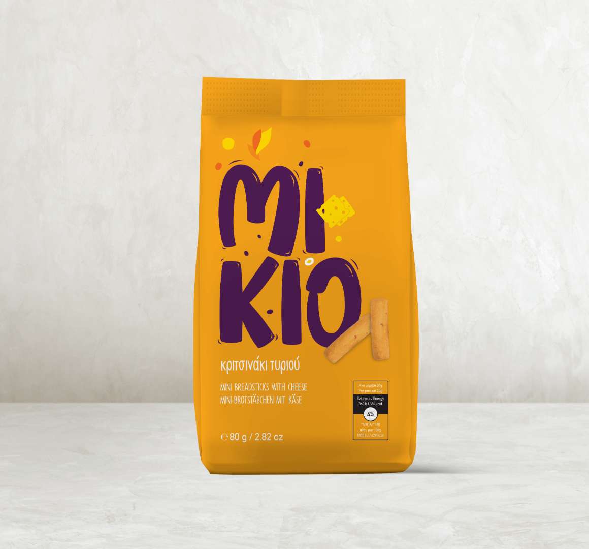
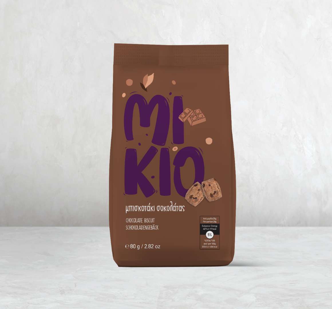
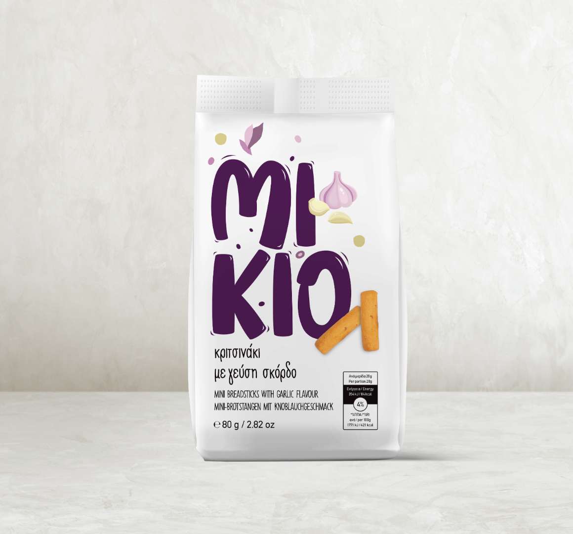
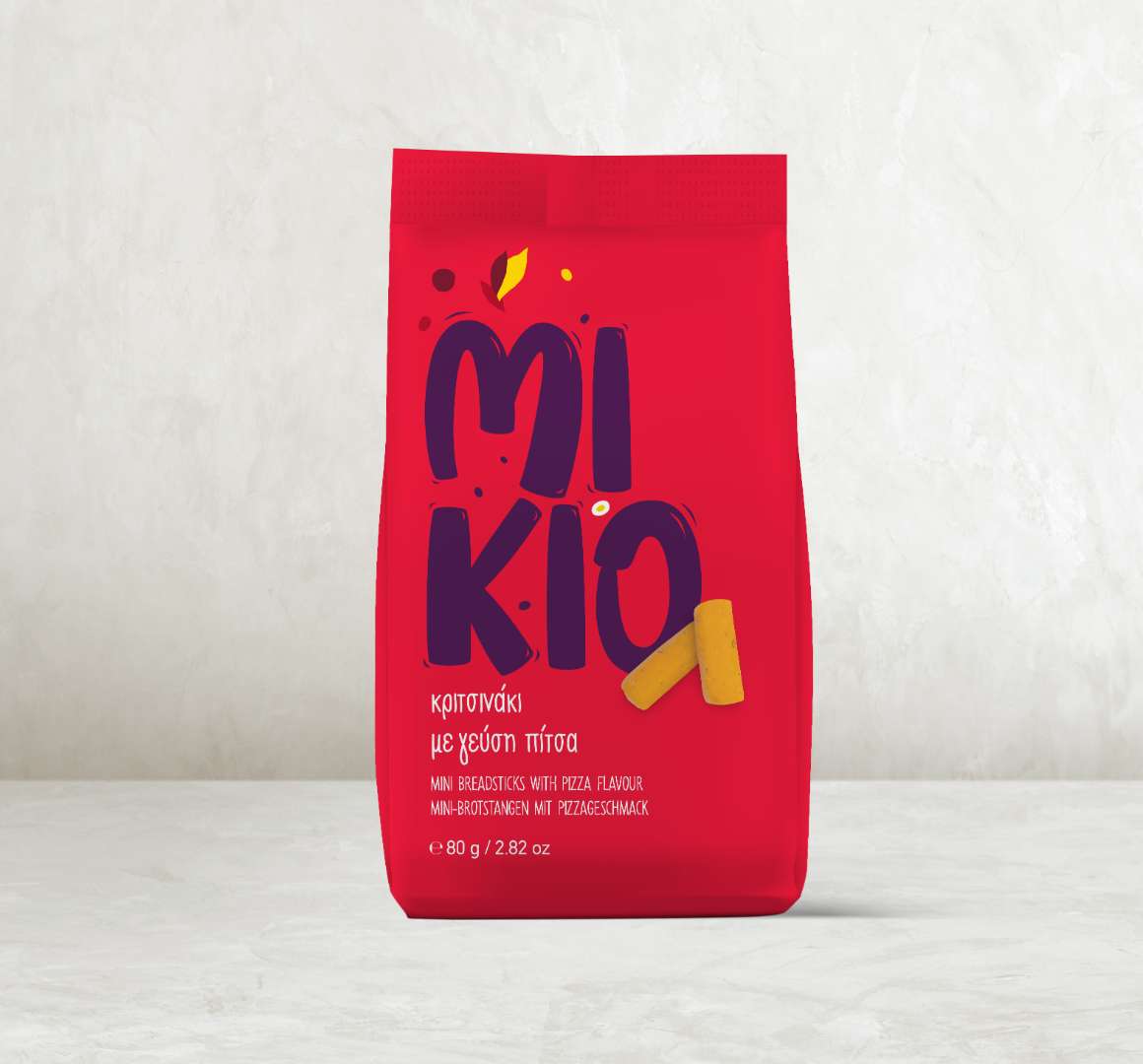
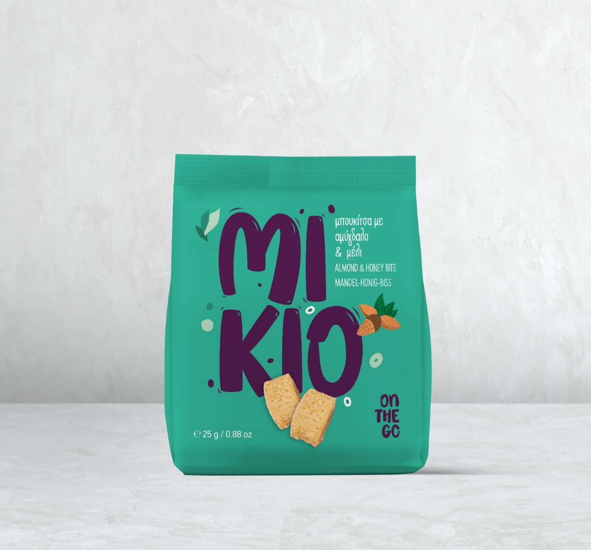
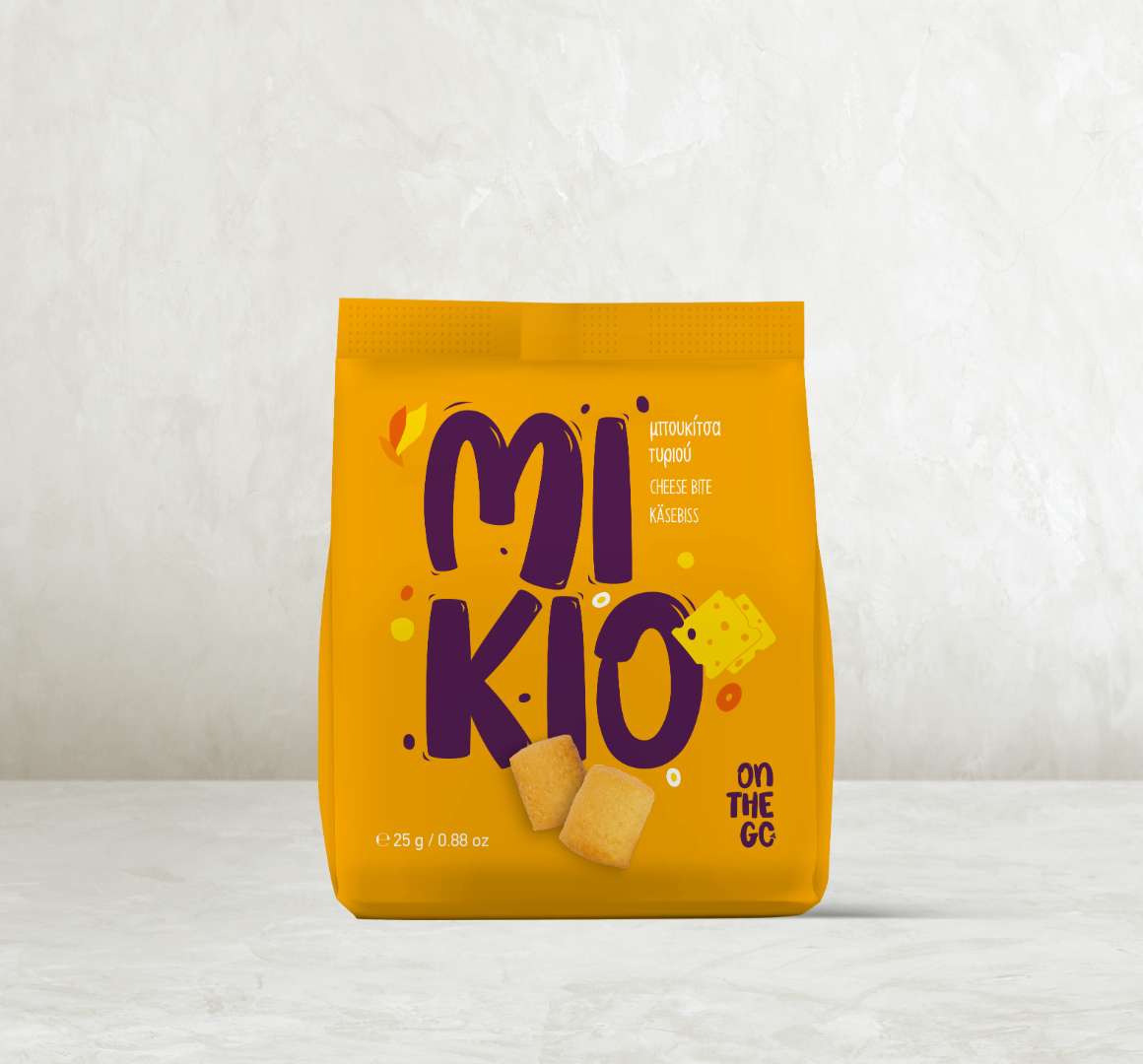
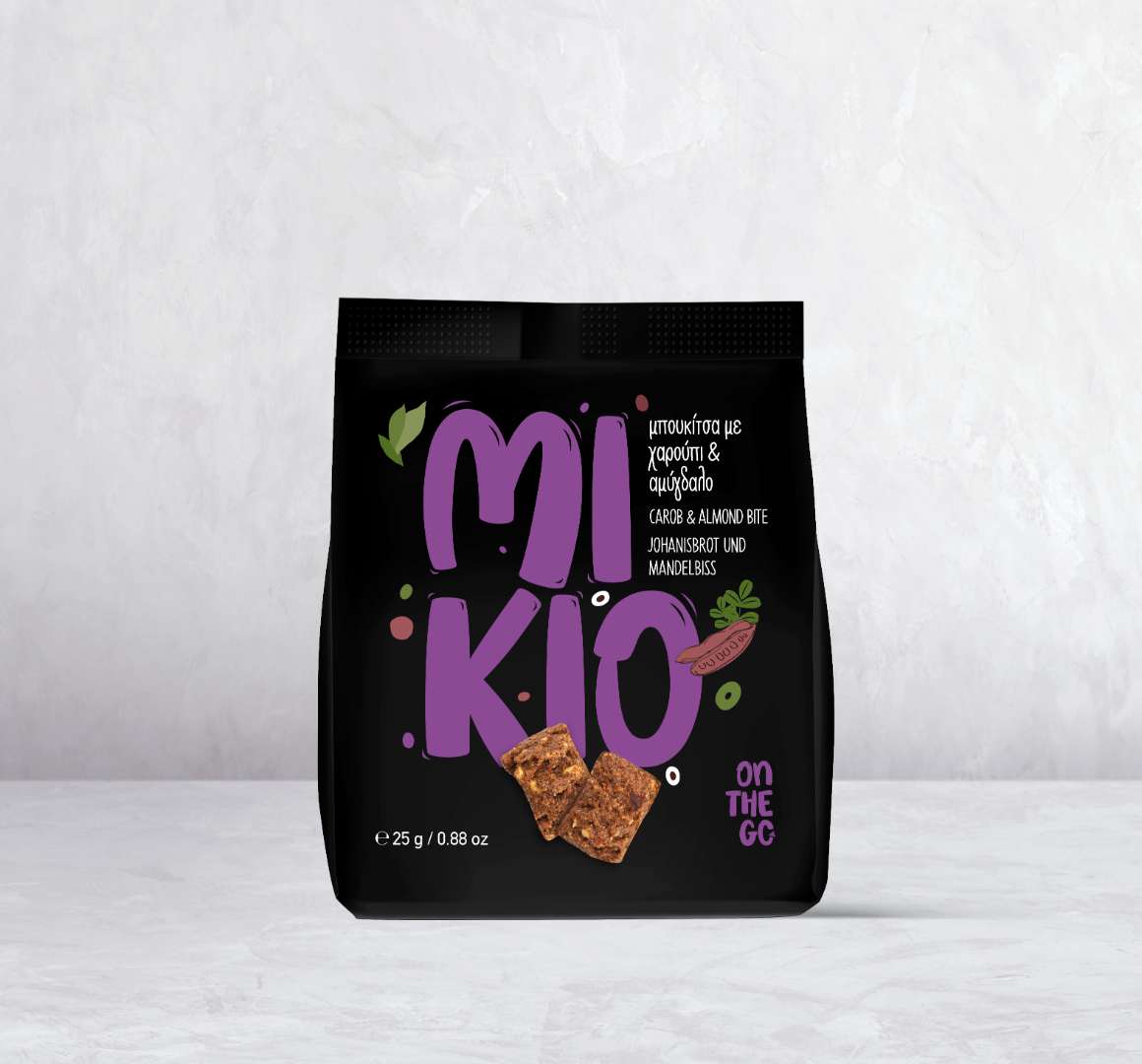
To bring MIKIO Bites to life, we designed a vibrant and modern brand identity, focusing on strong color coding to distinguish each flavor while maintaining a cohesive look across the product line. The new logo, bold yet approachable, reflects the snack’s lighthearted and dynamic personality.
We crafted cheerful, eye-catching packaging that communicates fun and convenience, reinforcing MIKIO as the perfect companion for any moment of the day. With two available sizes (25g & 80g), the packaging design ensures portability while making a bold visual impact.
The Result
The rebranding of MIKIO Bites transformed it into a standout snack with high shelf visibility and strong brand recall.
By aligning the visual identity with the tastes and preferences of a younger audience, the brand now exudes energy, playfulness, and irresistible flavor—making MIKIO not just a snack, but a statement.